Back
01 / 06

Web Platform

CLIENT PROJECT

Artistry Community: Designing an engaging online exhibition experience

Artistry Community: Designing an engaging online exhibition experience

Turning an online slideshow into an immersive
exhibition for both artists and viewers.

Turning an online slideshow into an immersive
exhibition for both artists and viewers.

My Role

Product Designer

Timeline

3 months
2026

3 months
2026

Team

2 Designers

1 Developer
1 CEO

2 Designers

1 Developer
1 CEO

TYPE

Online Exhibition Platform

Overview

From slideshow to exhibition

From slideshow to exhibition

Artistry Community is an online exhibition platform for emerging artists. The experience felt closer to a slideshow and artists got visibility but no follow-up signals.

I joined as a volunteer designer. With 4 artist interviews and 15 viewer test responses, I redesigned the flow into themed segments, added interactions, and built a visitor book to hand off engineering specs for 5 fully annotated states.

100%

100%

of artists wanted change

33%

33%

answered it's not engaging enough

7 2.6 s

7 2.6 s

Avg engagement time

Step 01

UX Audit

Current flow audit

Step 02

User Research

Interview & User testing

Step 03

Prototyping

Rapid Iteration Loop

Step 04

Ship

Handoff

Quick View PROTOTYPE

Red-dot hotspot interaction

Red-dot hotspot interaction

Clickable hotspots reveal artist context inline (inspiration, medium, process) without leaving the artwork or losing the visual focus.

Clickable hotspots reveal artist context inline (inspiration, medium, process) without leaving the artwork or losing the visual focus.

Decoupled artwork & text flow

Decoupled artwork & text flow

Artwork-first view with a separate, optional context layer. Reduces visual noise and lets the work breathe.

Artwork-first view with a separate, optional context layer. Reduces visual noise and lets the work breathe.

Problem

Exhibition in name, slideshow in reality

Exhibition in name, slideshow in reality

We combined qualitative artist interviews with quantitative Maze testing, two angles on the same problem.

We combined qualitative artist interviews with quantitative Maze testing, two angles on the same problem.

Qualitative

4 emerging artists · 38–52 min interviews

“Exposure is nice, but it doesn't lead anywhere. We need feedback to grow.”

— Common theme across all 4 artists

Quantitative

15 viewers · Maze prototype test (Q1–Q9)

62%

wanted to revisit a specific artwork

33%

stopped for not engaging enough

“The exhibition feels very flat — not much interaction. Feel less immersive.”

— Q6 Open Response · Participant 499770890

Research & Strategy

Insight to decision

Insight to decision

01

01

Takeaway

Viewers got fatigued at dense, text-heavy sections — and 62% wanted to revisit a specific work without easily being able to.

Viewers got fatigued at dense, text-heavy sections — and 62% wanted to revisit a specific work without easily being able to.

Decouple artwork from text

02

02

Takeaway

33% stopped because it wasn't engaging enough — clicking 'next' replaced actually looking at the work.

33% stopped because it wasn't engaging enough — clicking 'next' replaced actually looking at the work.

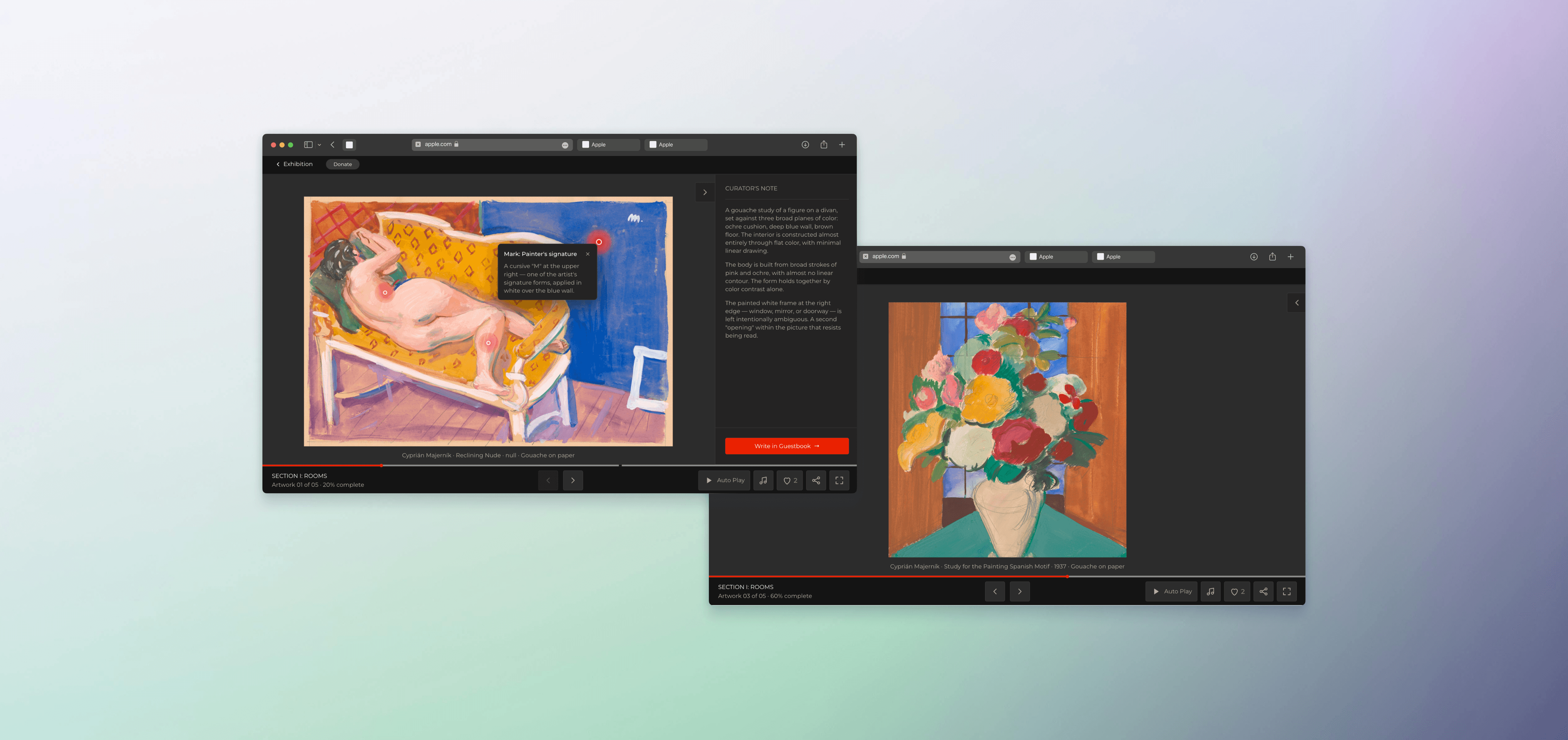
Red-dot hotspots on artwork

03

03

Takeaway

4/4 artists said exposure alone wasn't valuable — they wanted feedback and follow-up signals.

4/4 artists said exposure alone wasn't valuable — they wanted feedback and follow-up signals.

Guest book for engagement signals

Design Process

Rapid AI-assisted iteration loop

Rapid AI-assisted iteration loop

With 3 months of volunteer time and no dedicated UI designer, I leaned on AI to compress the visual exploration phase. Four full drafts in three weeks each one tested, scrapped, or refined based on artist and viewer feedback before moving forward.

With 3 months of volunteer time and no dedicated UI designer, I leaned on AI to compress the visual exploration phase. Four full drafts in three weeks each one tested, scrapped, or refined based on artist and viewer feedback before moving forward.

Design Process

Designing for handoff

Designing for handoff

Once the three moves were defined, I packaged them for engineering. Volunteer projects rarely get a second design pass, so the first handoff has to be airtight. I delivered a complete component library plus 5 annotated screen states with CSS specs, transitions, and edge-case behaviors mapped out for the dev team.

Once the three moves were defined, I packaged them for engineering. Volunteer projects rarely get a second design pass, so the first handoff has to be airtight. I delivered a complete component library plus 5 annotated screen states with CSS specs, transitions, and edge-case behaviors mapped out for the dev team.

Outcome

From AI prototype to production

From AI prototype to production

Deliverable was a developer-ready handoff, not a shipped product. So I'm only reporting on what I can verify: artist satisfaction from follow-up interviews, and the structural reduction in exhibition length.

Deliverable was a developer-ready handoff, not a shipped product. So I'm only reporting on what I can verify: artist satisfaction from follow-up interviews, and the structural reduction in exhibition length.

Before

quiet-custard-bd4e5c.netlify.app/

After

preeminent-cobbler-d735d0.netlify.app/

4/4

Artist Satisfaction

20%

Pages reduced

Reflection

How this project changed how I design

How this project changed how I design

01

Constraints sharpen decisions

Volunteer non-profit work has no budget for 'nice-to-haves.' Every feature had to justify itself against the 3-month timeline. This project taught me to ask 'what's the smallest thing that proves this hypothesis?' before designing.

02

Two users, one root cause

Artists and viewers looked like separate problems. But the root cause — the platform as a content container, not an exhibition — was shared. Finding the unifying insight made the solution set much smaller.

03

Engineers are design partners

The developer's push-back on the Visitor Book turned a risky feature into a safer, more maintainable one. Systems thinking includes systems I don't build myself.

What I'd do differently

Run usability tests earlier with the CEO included. A few tensions between stakeholder vision and user research came up late, inviting the CEO into testing sessions directly would have aligned everyone faster.