Base London Homapage Revamp
Base London Homapage Revamp
Footwear brand based in London, United Kindom
Footwear brand based in London, United Kindom

Team
Team
1 Project Manager
1 Marketing Manager
1 UX/UI Designer
1 Developer
1 Project Manager
1 Marketing Manager
1 UX/UI Designer
1 Developer
Role
Role
User Research
Web Design
User Experience Design
User Research
Web Design
User Experience Design
Tools
Tools
Figma
Figma
Timeline
Timeline
Feb - Mar 2024
Feb - Mar 2024
So, what project is it?
So, what project is it?
Project Overview
Project Overview
Base London is a London-based footwear brand primarily targeting British men with a passion for high-quality shoes. The client sought to reinforce their bold and premium brand identity through this project, so I focused on creating an authentic website design while ensuring a seamless user experience.
Base London is a London-based footwear brand primarily targeting British men with a passion for high-quality shoes. The client sought to reinforce their bold and premium brand identity through this project, so I focused on creating an authentic website design while ensuring a seamless user experience.
Quick Overview
Quick Overview
Strengthen brand identity of Base London
Strengthen brand identity of Base London

Quick Overview
Quick Overview
Enhance user engagement and browsing efficiency
Enhance user engagement and browsing efficiency


Understanding Our Client Need
Understanding Our Client Need


Base London is a well-known premium footwear brand in United Kingdom, established in 1995. As a premium footwear brand in London with long history, Base London has been aiming to convey bold and premium brand identity to to their male customer base.
Therefore, our client wanted to strengthen this identity on their website to have more opportunities to connect with their potential customers. They aim to reinforce their strong brand identity through this project and affect business growth eventually by not only providing a visually appealing web design, but also delivering seamless user experience where potential customers can easily find the product they are looking for.
The core objectives of the project included reinforcing the brand's identity and increasing user engagement.
What do potential customer want, and why?
What do potential customer want, and why?
User Research
User Research
We conducted interview with 5 potential customers to identify the main pain points to comprehend the difficulty they encountered in exploring products and the impression of the brand through the experience.
We conducted interview with 5 potential customers to identify the main pain points to comprehend the difficulty they encountered in exploring products and the impression of the brand through the experience.


Key Insight & Problem Analysis
Key Insight & Problem Analysis
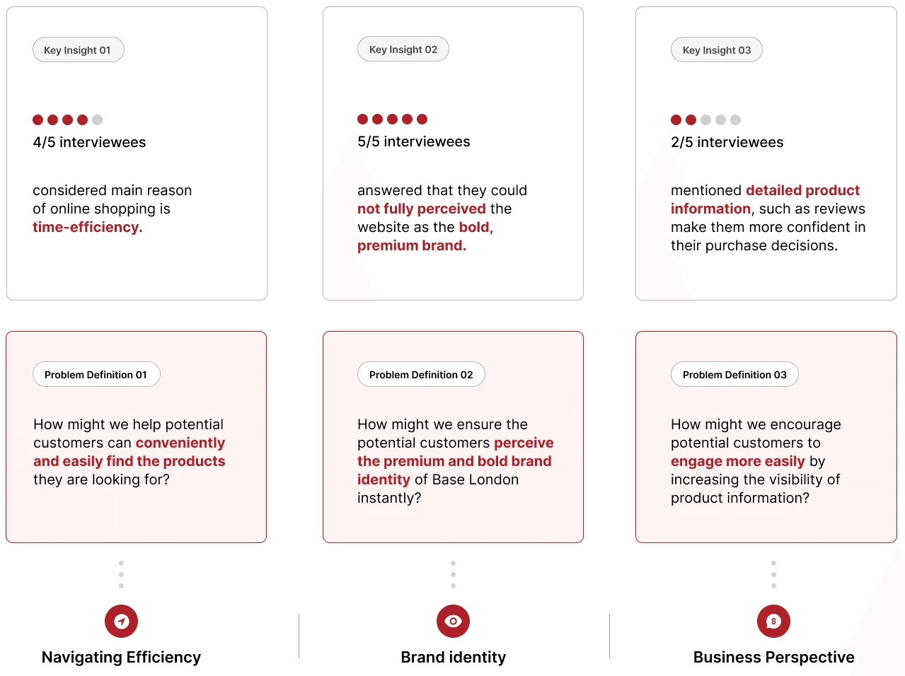
Based on interview, I gathered key insights to identify the major needs of our targeted audience. Through this process, I figured out that the brand identity was not effectively conveyed and also, online shoppers highly value time efficiency and other customers' opinions when making purchase decisions.
With these isights, I came up with three problem definitions that connected user’s needs with expected outcome of this project, aligning with our business goals. With this process hereafter, I would have a deeper analysis of the three key points to consider to help me keep on track.


How can I approach to solve the problems?
How can I approach to solve the problems?
Brainstorming
Brainstorming
Now I understood the need of our clients and potential customers, I decided to dive into the brainstorming steps to have concrete solutions.
I kicked off brainstorming by conducting current website audit to identify the space of future improvement and competitive analysis to understand how other websites communicate with their online shoppers. This process allowed me to visualize how I can approach this project, solving problems efficiently.
First approach
First approach
Current Website Audit
Current Website Audit
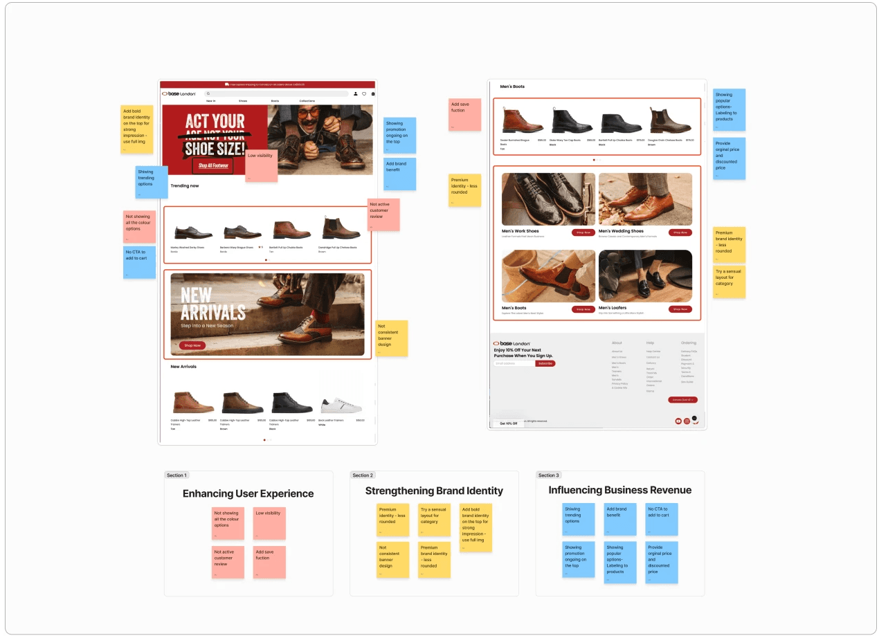
Before conducting this audit, I divided the areas for improvement into three major categories to address both user needs and business objectives. By having a detailed website audit, I could identified specific areas for improvement and took the time to consider how I can change those. This process allowed me to picture how the site could be enhanced.
Before conducting this audit, I divided the areas for improvement into three major categories to address both user needs and business objectives. By having a detailed website audit, I could identified specific areas for improvement and took the time to consider how I can change those. This process allowed me to picture how the site could be enhanced.


Second approach
Second approach
Competitive Analysis
Competitive Analysis
I compared 3 premium men's footwear brands — John Lobb, Lacoste, and Ralph Lauren — to understand how they showcase their products and their brand identity. My goal was to see how these brands show their premium brand image and how their websites attempt potential customers from making confident decisions.
I compared 3 premium men's footwear brands — John Lobb, Lacoste, and Ralph Lauren — to understand how they showcase their products and their brand identity. My goal was to see how these brands show their premium brand image and how their websites attempt potential customers from making confident decisions.
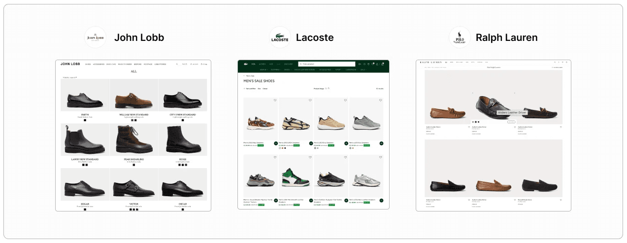
After conducting a competitive analysis, I could be able to find common area of these competitors that can be adapted to this project. Therefore, I tried the following actions:
After conducting a competitive analysis, I could be able to find common area of these competitors that can be adapted to this project. Therefore, I tried the following actions:
Highlight specific line of products or promotions in the top banner with CTAs.
Highlight specific line of products or promotions in the top banner with CTAs.
Include clear product information along with a save feature for easy user reference in product cards.
Include clear product information along with a save feature for easy user reference in product cards.
Utilize layouts that effectively convey a luxurious brand image.
Utilize layouts that effectively convey a luxurious brand image.
Solution
Solution
By gathering the insights that I gained during brainstorming stage, I have solutions to execute ideate homepage design.
By gathering the insights that I gained during brainstorming stage, I have solutions to execute ideate homepage design.
Enhancing Brand Identity: Implement bold, premium visuals, including full-sized images, rich colors (like deep reds), and striking typography to strengthen the brand's identity.
Enhancing Brand Identity: Implement bold, premium visuals, including full-sized images, rich colors (like deep reds), and striking typography to strengthen the brand's identity.
Improving Product Exploration: Introduce intuitive navigation features, allowing users to browse products more efficiently and filter by options such as new arrivals or bestsellers.
Improving Product Exploration: Introduce intuitive navigation features, allowing users to browse products more efficiently and filter by options such as new arrivals or bestsellers.
Attempting Call to Action: Place visible, action-oriented CTAs at key touchpoints, such as highlighting bestselling products and showcasing seasonal offers, to prompt immediate user interaction.
Attempting Call to Action: Place visible, action-oriented CTAs at key touchpoints, such as highlighting bestselling products and showcasing seasonal offers, to prompt immediate user interaction.
How did it work and developed?
How did it work and developed?
Ideation
Ideation
Now that we’ve identified how to solve the key problems, it was time to visualize the solutions. To have better understanding the client’s needs, I created three different options for both the overall homepage design and the product card.
Now that we’ve identified how to solve the key problems, it was time to visualize the solutions. To have better understanding the client’s needs, I created three different options for both the overall homepage design and the product card.


Iteration
Iteration
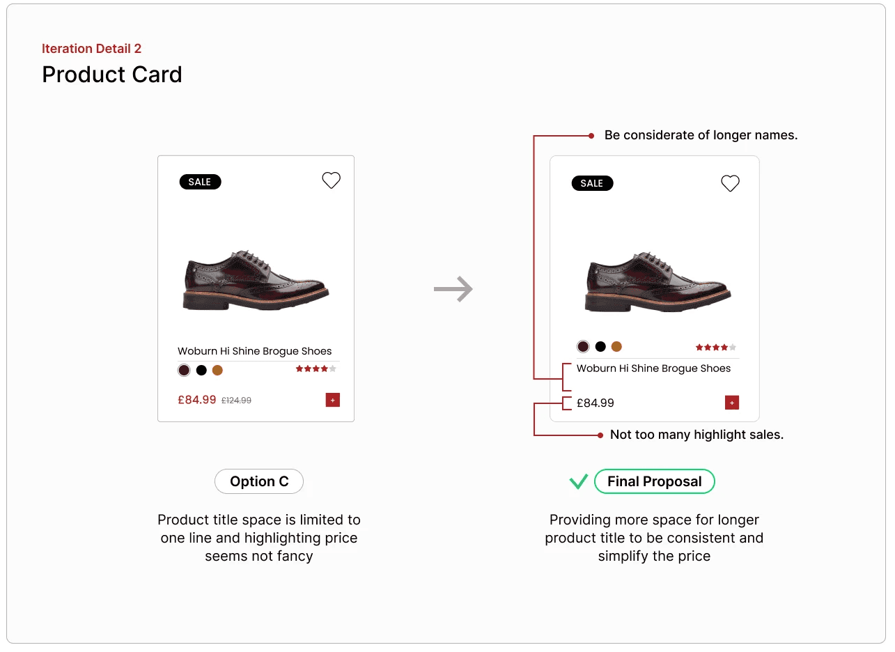
Based on feedback that I gathered in our team and from our clients, I had a few opportunities to tweak design to represent clean and simple, optimizing user engagement.
Based on feedback that I gathered in our team and from our clients, I had a few opportunities to tweak design to represent clean and simple, optimizing user engagement.

And here we are!
And here we are!
Final Proposal
Final Proposal
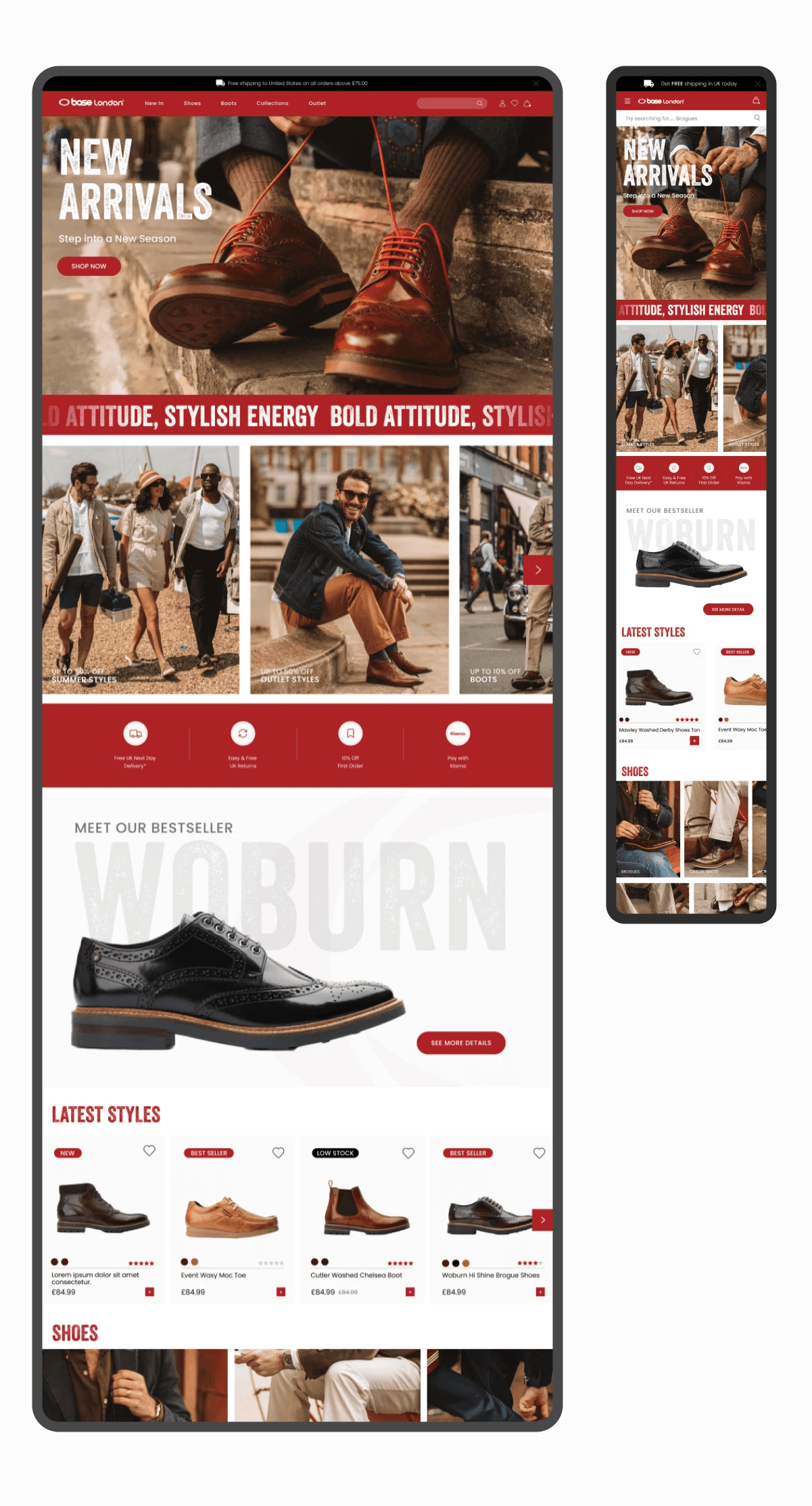
A bold and premium homepage design for the Base London homepage, enhancing user experience and encouraging instant engagement.
A bold and premium homepage design for the Base London homepage, enhancing user experience and encouraging instant engagement.


Solution
Solution
Strengthening Brand Identity
Strengthening Brand Identity
Based on the client’s needs and insights from potential customer interviews, the brand image needed to reflect a bold and premium men's footwear identity. Hence, I mainly used a striking red colour palette which is Base London’s main brand colour, with clean and bold typography, and impactful imagery to convey a strong brand presence.
Based on the client’s needs and insights from potential customer interviews, the brand image needed to reflect a bold and premium men's footwear identity. Hence, I mainly used a striking red colour palette which is Base London’s main brand colour, with clean and bold typography, and impactful imagery to convey a strong brand presence.

Solution
Solution
Promoting the Brand - Bestsellers & Benefits
Promoting the Brand - Bestsellers & Benefits
To increase user engagement, the website highlighted the benefits of shopping online with Base London and introduced a section for bestsellers to attract users to browse more products, encouraging users to when they make purchasing decisions.
To increase user engagement, the website highlighted the benefits of shopping online with Base London and introduced a section for bestsellers to attract users to browse more products, encouraging users to when they make purchasing decisions.

Solution
Solution
Supporting User Efficiently Browsing
Supporting User Efficiently Browsing
Call-to-action buttons were strategically placed to enable users to quickly access new arrivals and bestsellers. Additionally, by adding colour options and product status labels, users can browse and compare products easily. Also, save and add-to-cart buttons will prompt user to show actions, enhancing the shopping experience.
Call-to-action buttons were strategically placed to enable users to quickly access new arrivals and bestsellers. Additionally, by adding colour options and product status labels, users can browse and compare products easily. Also, save and add-to-cart buttons will prompt user to show actions, enhancing the shopping experience.


Note:
This project was part of a marketing agency proposal for Base London. The designs presented here were proposed to address the client's needs, and are currently undergoing additional iteration processes within Base London for potential future implementation.
Note:
This project was part of a marketing agency proposal for Base London. The designs presented here were proposed to address the client's needs, and are currently undergoing additional iteration processes within Base London for potential future implementation.
What did I learn from this project?
What did I learn from this project?
Takeaways
During this project, I could deeply understand of the importance of having solid foundation of the project before diving into visualizing stage. To be more specific, the key takeaways were:
The Importance of Clearly Defining Problems: Identifying the problem definition prevents the project from going in the wrong direction which often happens when designers do not have clear goals. This way, it enables efficient development, not waste time for many times of revisions.
Value of Iteration: Although this project relied mainly on internal feedback since it was a proposal to an external company, the iterative process proved valuable for refining the design, allowing us to see the whole process from different perspectives.